Rules for using flexbox and breakpoints
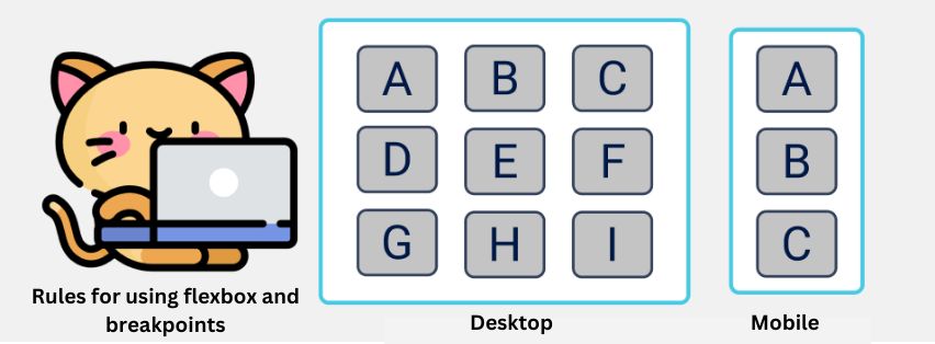
Flexbox and breakpoints are two important concepts in web design that allow for the creation of responsive websites. Flexbox is a layout module that allows for the creation of flexible and responsive layouts, while breakpoints are points at which the layout of a website changes depending on the size of the screen. In order to […]