Jully 18, 2022
Rules for using flexbox and breakpoints
Flexbox and breakpoints are two important concepts in web design that allow for the creation of responsive websites. Flexbox is a layout module that allows for the creation of flexible and responsive layouts, while breakpoints are points at which the layout of a website changes depending on the size of the screen. In order to create effective and efficient websites, it is important to understand the rules for using flexbox and breakpoints. This essay will discuss six rules for using flexbox and breakpoints in web design.
Understand Flexbox
Flexbox is a powerful tool for creating responsive layouts. It allows for the creation of flexible containers that can be used to create complex layouts with ease. In order to effectively use flexbox, it is important to understand the basic concepts behind it. Flexbox works by defining a container element, which is then filled with elements that can be arranged in any way desired. The container element can be set to have a certain width, height, and alignment, which will affect how the elements within it are arranged. Additionally, flexbox allows for the creation of nested containers, which can be used to create even more complex layouts.
Use Breakpoints
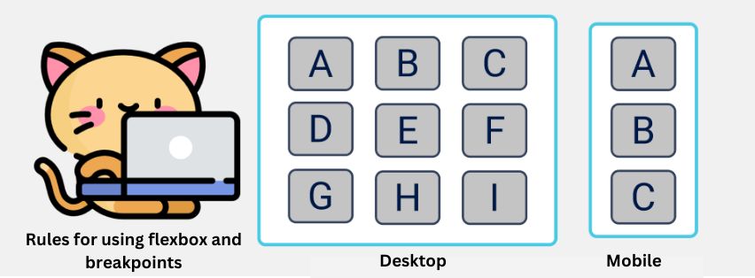
Breakpoints are points at which the layout of a website changes depending on the size of the screen. Breakpoints are typically set at specific widths, such as 320px, 480px, 768px, and 1024px. When designing a website, it is important to consider how the layout will change at each breakpoint. For example, if a website has a sidebar that is visible on desktop screens, it may need to be hidden on mobile screens in order to make the content more readable. By setting breakpoints at each width, the website can be designed to adjust its layout accordingly.
Consider Responsive Design
When designing a website, it is important to consider how it will look on different devices. Responsive design is a technique that allows websites to adjust their layout depending on the size of the screen. By using flexbox and breakpoints, it is possible to create websites that look great on any device. Additionally, responsive design allows for websites to be optimized for different devices, such as mobile phones and tablets. By considering responsive design when designing a website, it is possible to create an experience that looks great on any device.
Utilize Flexible Units
When designing a website with flexbox, it is important to use flexible units such as percentages and ems. By using flexible units, it is possible to create layouts that are responsive and look great on any device. Additionally, flexible units allow for elements to scale up or down depending on the size of the screen. This makes it easier to create layouts that look great on any device without having to manually adjust them for each device.
Test Across Devices
When designing a website with flexbox and breakpoints, it is important to test the design across different devices. This will ensure that the design looks great on any device and that all of the breakpoints are working correctly. Additionally, testing across devices will help identify any potential issues with the design before it goes live. By testing across devices, it is possible to ensure that the design looks great on any device.
Use Media Queries
Media queries are a powerful tool for creating responsive designs with flexbox and breakpoints. Media queries allow for the creation of rules that will only be applied when certain conditions are met. For example, a media query can be used to change the font size of an element when the screen size is less than 768px wide. By using media queries, it is possible to create designs that look great on any device without having to manually adjust them for each device.
Conclusion:
In conclusion, flexbox and breakpoints are two important concepts in web design that allow for the creation of responsive websites. In order to create effective and efficient websites, it is important to understand the rules for using flexbox and breakpoints. This essay discussed six rules for using flexbox and breakpoints in web design: understanding flexbox, using breakpoints, considering responsive design, utilizing flexible units, testing across devices, and using media queries. By following these rules, it is possible to create websites that look great on any device.
Recent Posts

Evolution of making money online
Jully 11, 2022

8 Tips That Will Make You an Influencer marketer
Jully 11, 2022

The Evolution of Artificial Intelligence: From Science Fiction to Everyday Reality
Jully 11, 2022


